
Color psychology plays a significant role in interior design, influencing emotions, perceptions, and behaviors within a space. Here’s how you can effectively utilize color psychology in your interior design:
- Understanding Color Associations:
- Warm Colors: Colors like red, orange, and yellow are associated with warmth, energy, and stimulation. They can create a cozy and inviting atmosphere, making them ideal for areas where social interaction is desired, such as living rooms and dining areas.
- Cool Colors: Colors like blue, green, and purple evoke calmness, serenity, and relaxation. These hues are suitable for spaces where a tranquil and peaceful environment is desired, such as bedrooms or meditation rooms.
- Creating Mood and Ambiance:
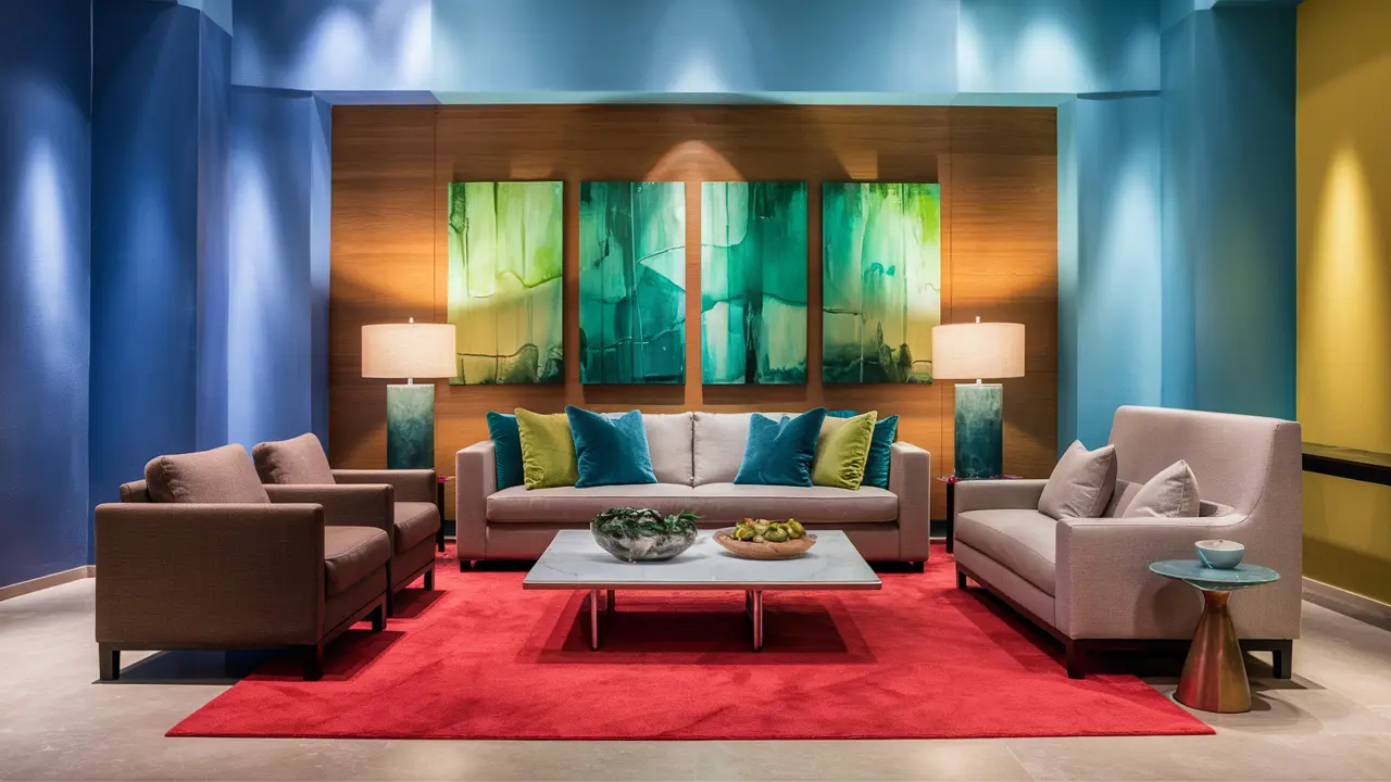
- High-Contrast Colors: Contrasting colors (e.g., black and white, or complementary colors) can create a dynamic and dramatic atmosphere. They are often used in contemporary and modern interior designs to make a bold statement.
- Monochromatic Schemes: Using varying shades and tints of a single color can create a harmonious and sophisticated ambiance. This approach is particularly effective in minimalist or Scandinavian interiors.
- Balancing Energy Levels:
- Energizing Spaces: To boost energy levels, use vibrant and saturated colors like bright yellows or oranges in spaces such as home offices or workout areas.
- Calming Spaces: For areas where relaxation is key, opt for softer shades of blue or green to promote a sense of calm and tranquility, such as in bedrooms or reading nooks.
- Consider Cultural and Personal Preferences:
- Cultural associations with colors can vary significantly, so it’s essential to consider the cultural context of your design. For example, white might symbolize purity and simplicity in Western cultures but mourning in some Eastern cultures.
- Personal preferences also play a role. Some individuals may find certain colors soothing while others may find them stimulating or even unsettling.
- Application Techniques:
- Accent Walls: Use a bold color on one wall (accent wall) to create a focal point or add depth to a room without overwhelming the entire space.
- Color Blocking: Experiment with color blocking techniques where different sections of a wall or furniture are painted in contrasting or complementary colors to add visual interest.
- Accessories and Décor: Incorporate colors through accessories such as throw pillows, rugs, artwork, and curtains. This allows for flexibility in changing color schemes over time.
- Natural Light and Artificial Lighting:
- Consider how natural light interacts with colors throughout the day. Warm colors can appear more intense under direct sunlight, while cool colors may appear subdued.
- Artificial lighting can also affect how colors are perceived. Use different light sources (e.g., warm vs. cool LED lights) strategically to enhance or soften the impact of colors in a space.
By applying color psychology principles thoughtfully, you can create interiors that not only look visually appealing but also evoke the desired emotional and psychological responses from occupants. Whether you aim to energize, calm, or inspire, colors can be a powerful tool in shaping the ambiance and functionality of interior spaces..